 |
 |
 |
Multi_R_Designer
Tutorial |
 |
 |
 |
AA
Sub-problem 2.1:
Total pressure drop vs. gas mass flow rate (discriminate: liquid mass flow
rate)
1) After completing Case
problem I (if the project is closed, open it), select the Plot button  .
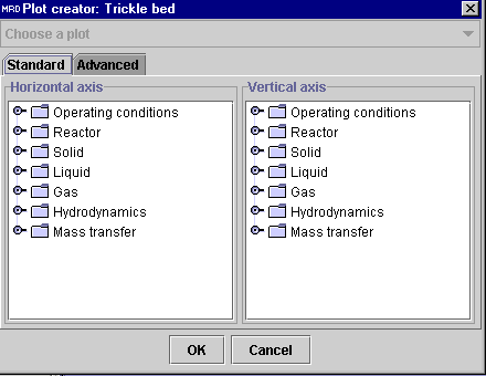
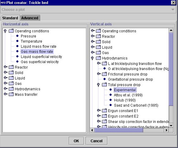
The Plot creator dialog window will be presented to the user.
2) To specify the X-axis value,
click on the "knob" corresponding to Operating conditions in the
Horizontal
axis panel. Select Gas mass flow rate.
3) To specify the Y-axis value,
click on the knob corresponding to Hydrodynamics in the Vertical
axis panel. Click on the knob corresponding to Total pressure drop,
and select Experimental (N.B. the Experimental option relates
to the experimental values from the database while other entries such as
Attou
et al. (1999), Holub (1990) are predictions of total pressure drop
from the corresponding models. This part will be discussed later).
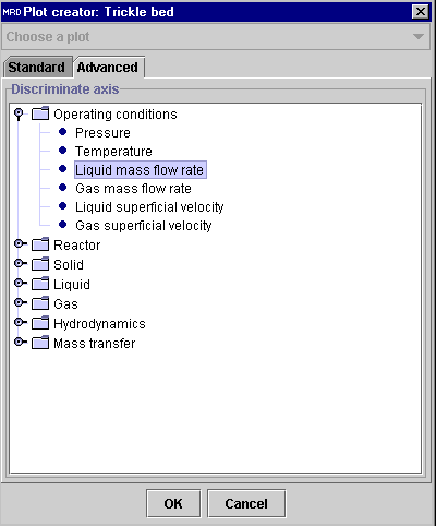
4) To specify the Z-axis (or
discriminate) value, choose the Advanced tab. Click on the knob
corresponding to Operating conditions, and select Liquid mass
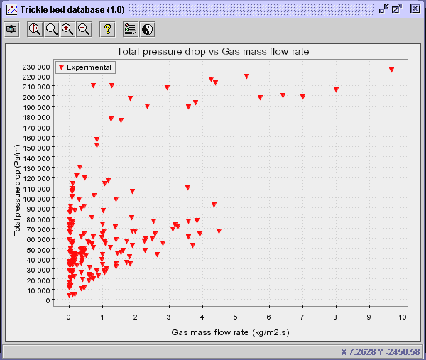
flow rate. Press OK. The following diagram will appear.
Chart edition options: The following explanations relate
to chart editing.
-
To save the diagram into an image file
(.jpg) at any given time, the photo camera icon
 can be used.
-
To zoom the diagram (or adjust the axes
scale), the Zoom
 ,
Zoom To Fit
  ,
Zoom
In
  and Zoom Out
  buttons can be used.
-
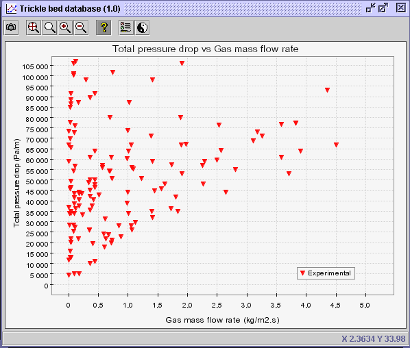
For example, based on the previous diagram,
lets say the user is interested to find information for frictional pressure
drop below 100,000 Pa/m for gas mass flow rate below 1 kg/m2s.
To zoom the diagram within these boundaries, select the Zoom button
 and select a square on the graph that encircles the following ranges: Y-axis:
0-100,000 Pa/m; X-axis: 0-1 kg/m2s. The diagram
scale will automatically be readjusted to the selected region.
Warning: If the selection
on the graph surpasses or even touches one of the axis, the zooming process
will not execute.
 |
|
-
To recover the previous diagram, the user can use the Zoom to Fit
button
 ,
which will readjust the axis scale based on the 169 data sets originally
displayed on the diagram. It basically returns to the original diagram.a
-
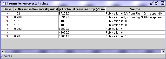
If the user is more interested in a couple of points, lets say for gas
mass flow rates close to 1.0 kg/m2s, and wants to know the whereabouts
of these experimental data, the Informations
of selected points button
 can be used. It enables the user to select a group of points on the diagram.
In this case, the following window dialog will appear.
 |
-
Seven experimental data were extracted from 3 different authors (Publications
0, 10 & 11 - see
 for the complete reference). When available, additional information relative
to the figures or tables from which the data were extracted are added here.
For example, the Y-value (Frictional pressure drop) for the first data
point was taken from Figure 3.6f in the appendix of Publication 0 (Larachi,
F.).a
-
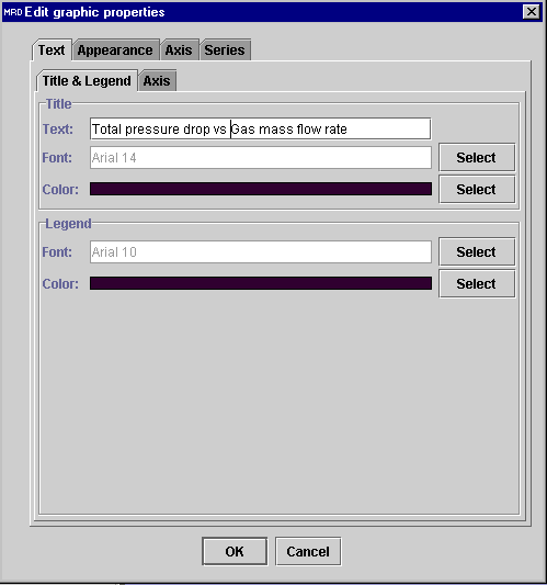
To edit the diagram to the user's will, select the Edit graphic properties
button
 .
The following dialog window will appear.
 |
-
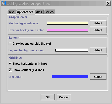
The chart editor is divided in 4 categories (Text properties, diagram
Appearance,
Axis
properties and data Series edition).
-
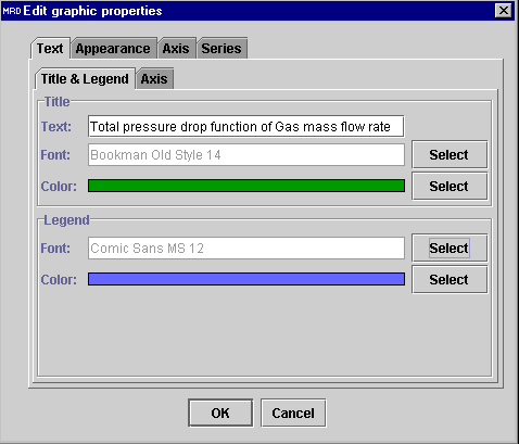
In the Title & legend tab (Text), the user is enabled
to change the diagram main Title, Font and Color as
well as the Legend Font and Color.
-
Change the Title for Total pressure drop diagram function of
Gas mass flow rate with a Font (Bookman Old Style, 14) and the
Color
from black to green.
-
Change the Legend Font to (Comic Sans MS, 12) and
the Color from black to blue.
-
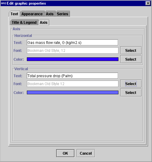
In the Axis tab (Text), the user is enabled to change the
axes title, font and color.
-
For example, change the Horizontal Axis Text for Gas mass flow
rate, G (kg/m2.s) with a Font (Bookman Old Style, 12) and the
Color
from black to blue.
-
Change the Vertical Axis Text for Total pressure drop (Pa/m)
with the Font (Bookman Old Style, 12) and the Color from
black to blue.
 |
 |
-
In the Appearance tab, the user is enabled to change the Chart
background
color,
Legend
background color and Grid lines properties.
-
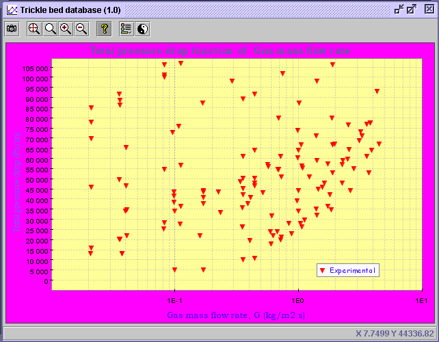
For example, change the Plot background color from white to yellow.
-
Change the Exterior background color from white to purple.
-
Change the Grid lines color in blue.
-
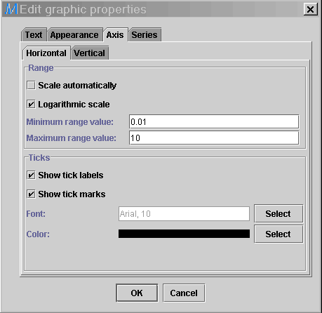
In the Axis tab, the user is enabled to modify the Range and
Ticks
of
the Horizontal and Vertical axes.
-
In the Horizontal tab, unselect the automatic scaling (Scale
automatically). Select Logarithmic scale. Enter
0.01
in the minimum value range and 10 in the maximum value range.
-
Press OK. The resulting diagram will be created.
5) Close the diagram. Then,
select again the Plot button  .
Recreate the same diagram in the Plot creator (STEP 3 and 4).
6) To discriminate the diagram
in terms of the liquid mass flow rate, select the Discriminate series
button  .
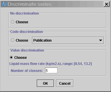
The following dialog window offers three options to the user. Choose
the Value discrimination option. The minimum and maximum values
for the discriminate (liquid mass flow rate - 169 data sets) are
presented (Min value: 8.54 kg/m2s; Max value: 13.2
kg/m2s). The Number of classes option prompts the user
to divide the min-max range into equally-spaced prescribed number of classes.
In this case, divide the discriminate into 5 classes. Press OK.
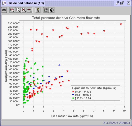
The following diagram with new data series will be created.
 |
 |
CONCLUSION: Even though 5 classes were specified for the
liquid mass flow rate, only 3 series are showcased in the legend.
As a matter of fact, Multi_R_Designer displays only ranges (or values)
that are present for the studied data sets. For example, the first segment
should have been classify between 8.54 and 9.47 kg/m2s
(Min value and Min value + (Max value - Min value)/5; 8.54
and 8.54+(13.2-8.54)/5 = 8.54 and 8.54+0.93 = 8.54
and
9.47).
However, there is no liquid mass flow rate at 9.47 kg/m2s
for the 169 data sets. Consequently, Multi_R_Designer displays the
closest value from 9.47 kg/m2s within the first segment
(8.54-9.47), which is 9.19 kg/m2s in this case.
 |
 |
 |
Multi_R_Designer
Tutorial |
 |
 |
 |
![]() .
The Plot creator dialog window will be presented to the user.
.
The Plot creator dialog window will be presented to the user.


![]() .
Recreate the same diagram in the Plot creator (STEP 3 and 4).
.
Recreate the same diagram in the Plot creator (STEP 3 and 4).
![]() .
The following dialog window offers three options to the user. Choose
the Value discrimination option. The minimum and maximum values
for the discriminate (liquid mass flow rate - 169 data sets) are
presented (Min value: 8.54 kg/m2s; Max value: 13.2
kg/m2s). The Number of classes option prompts the user
to divide the min-max range into equally-spaced prescribed number of classes.
In this case, divide the discriminate into 5 classes. Press OK.
The following diagram with new data series will be created.
.
The following dialog window offers three options to the user. Choose
the Value discrimination option. The minimum and maximum values
for the discriminate (liquid mass flow rate - 169 data sets) are
presented (Min value: 8.54 kg/m2s; Max value: 13.2
kg/m2s). The Number of classes option prompts the user
to divide the min-max range into equally-spaced prescribed number of classes.
In this case, divide the discriminate into 5 classes. Press OK.
The following diagram with new data series will be created.
